-
Installation
-
With Kamon Telemetry
-
How To Guides
-
Migrations
-
-
Core Concepts
-
Foundations
-
Advanced
-
-
Instrumentation
-
Supported Frameworks
-
Akka
-
Akka HTTP
-
Cassandra Driver
-
Caffeine
-
Elasticsearch
-
Executors
-
Futures
-
JDBC
-
Kafka
-
Logback
-
Play Framework
-
Spring Framework
-
System Metrics
-
-
-
Reporters
-
Kamon APM
-
Using Kamon APM
-
Overview
-
Services
-
Traces
-
Dashboards
-
Alerts
-
Hosts
-
Investigating Issues
-
Settings and Administration
-
-
Kamon APM Charts #
Kamon APM allows you to work with several types of charts, each meant to visualize different types of data. In this document, we will go through each chart type, as well as other chart features, such as legends, summaries, selection, and chart operations. We offer you many pre-built charts, but you can always add new charts of your own through alerts and dashboards.
Chart Types #
You will encounter several types of charts in Kamon APM, each with its use cases, features, and limitations. A quick overview of charts is as follows:
| Type | Instruments | Selection |
|---|---|---|
| Line | All | Time axis |
| Bar | All | Time axis |
| Histogram | Gauge, Histogram, Range Sampler, Timer | Value axis |
| Heatmap | Gauge, Histogram, Range Sampler, Timer | Both axes |
| Percentiles | Gauge, Histogram, Range Sampler, Timer | N/A |
Line Charts #
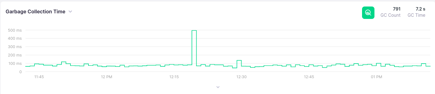
Line charts show values as one or more lines, with the x axis corresponding to time, and the y axis corresponding to the measured value. They are useful for visualizing counts, throughput, or various aggregations of values. The exact values that can be visualized depend on the metric instrument type.
| Instrument | Possible Visualizations |
|---|---|
| Counter | Count, Throughput, Sum |
| Gauge | Sum, Min, Max, Mean, Median, Percentile |
| Histogram | Count, Throughput, Sum, Min, Max, Mean, Median, Percentile |
| Range Sampler | Count, Throughput, Sum, Min, Max, Mean, Median, Percentile |
| Timer | Count, Throughput, Sum, Min, Max, Mean, Median, Percentile |
If values are grouped, multiple lines will be shown, one for each of the groups and with its own color. For more details on how to group values, read about dashboards, alerts, or how to use the analyze view.
Line chart support selection and zooming along the time axis (x axis).
Bar Charts #
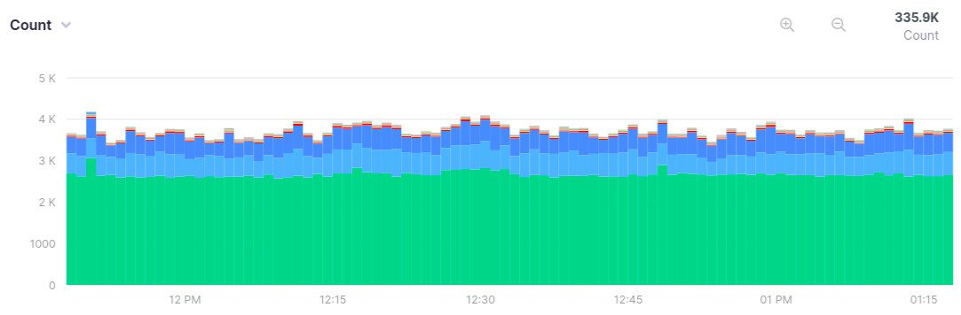
Bar charts show values as stacked bars, with the x axis corresponding to time buckets, and the y axis corresponding to the measured value. They are useful for visualizing counts, throughput, or sums of values, all of which can be visualized for any of the metric instrument types.
If values are grouped, multiple stacked blocks will be shown, one for each of the groups, and with its own color. For more details on how to group values, read about dashboards, alerts, or how to use the analyze view.
Bar chart support selection and zooming along the time axis (x axis).
Histogram Charts #
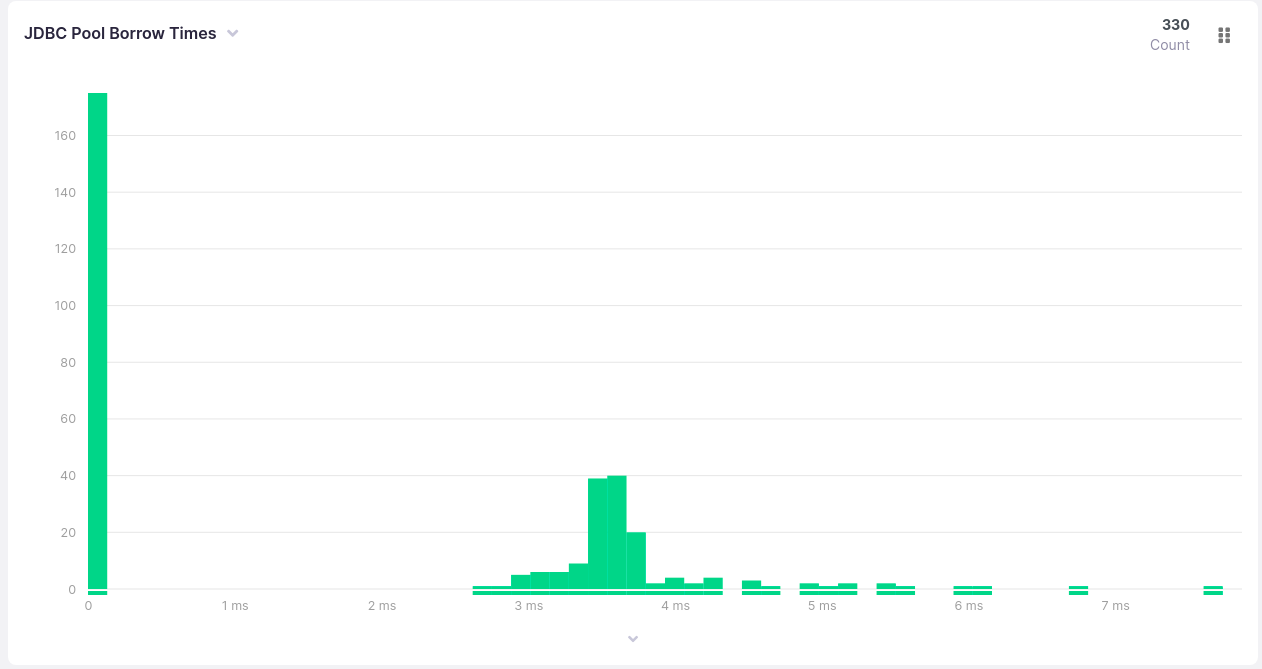
Histograms show the distribution of values grouped into value range buckets, with the height of the bar showing the number of entries that fall into each range. The x axis corresponds to the measured values in the distribution, and the y axis corresponds to the number of entries for that bucket. They are one of the traditional ways of visualizing distributions, and are available for gauge, histogram, range sampler and timer metric instrument types. Values in the chart will match the time selected in the time picker, but will do not display the time axis.
As with the bar chart, if values are grouped, multiple stacked blocks will be shown, one for each of the groups, and with its own color. For more details on how to group values, read about dashboards, alerts, or how to use the analyze view.
Histogram chart support selection and zooming into the value axis (x axis) in analyze view.
The summary of the histogram chart will always show the count of recorded values.
The legend will show the same values, but will respect grouping, if any is specified.
Heatmap Charts #
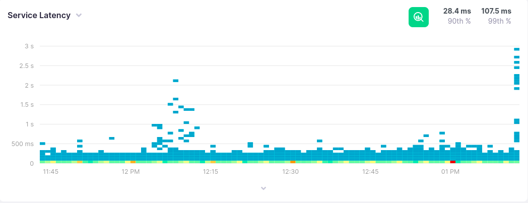
Heatmaps show the distribution of values in a given time period, as specified by the time picker. The x axis corresponds to time, while the y axis corresponds to the recorded values. Each entry inside of it is represented as a square and its colour will represent how often this value occurred in a given time period. Blue and green colors represent rare events, yellow and orange more common events, while red values represent that most values recorded belong to the given bucket. Exact counts in a bucket can be identified using the tooltip.
Heatmaps support selection and zooming along both axes, though zooming in on the y axis will only have an effect in analyze mode.
Percentile Charts #
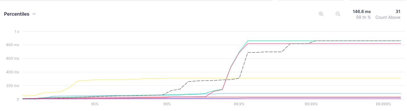
The percentiles chart shows at what percentile of recordings assume a certain value. On the x axis, the percentile at which a value first appears is shown, while on the y axis the values themselves are displayed. It is split into 45 buckets, with gradually reduced granularity and eventual precision of up to 3 decimals (up to the p99.999). They are available for gauge, histogram, range sampler and timer metric instrument types. Values in the chart will match the time selected in the time picker, but will do not display the time axis.
Like for line charts, if values are grouped, multiple lines will be shown, one for each of the groups and with its own color. In addition to that, a dashed line will be shown, with the overall distribution for all groups. For more details on how to group values, read about dashboards, alerts, or how to use the analyze view.
Percentiles charts do not support selection or zooming at all, as their purpose is to show the entire distribution.
The summary of the percentiles chart will always show two things:
- The value at p99
- The number of recorded values at higher percentiles
Information for other percentiles can be acquired via the tooltip, by hovering the chart.
The legend will show the same values as the summaries, but will respect grouping, if any is specified.
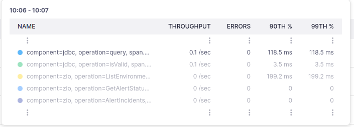
Chart Legend #
Every standard chart in Kamon APM has a legend that can be expanded. When expanded, it will show the legend in tabular format, with one row per group. Each row will have at least two columns, and can be sorted by any of the columns by clicking on the header. The first column will always be the name, which can be one of the following:
- Tags which make up the grouping (most common)
- Metrics, if multiple metrics are shown in the same chart (rare)
The name will also include a color indicator which matches the color the values assume in the chart above it (with the exception of the heatmap, which has different semantics).
The other column(s) depend on the chart in question, and can be the number of values, throughput, value at a certain percentile, or any other value that can be visualized in Kamon APM. These values will largely depend on the chart in question, and is arbitrary. The two exceptions are histograms and percentile charts, which will always have a pre-defined legend, as stated in sections dedicated to them.
By default, values will be shown for the entire area represented in the chart. To get values for a certain area, you can make a selection on the chart by clicking and dragging over an area. After you have selected an area, values will be shown exclusively for that area. There are two exceptions to this rule:
- Percentile charts do not support selection
- Values at a certain percentile will always be shown for the entire value axis, but may be constrained on the time axis
Clicking on a row will toggle whether that group is visualized in the chart (including heatmaps). By default, all groups are visualized.
Chart Summaries #
Every chart in Kamon APM has one or more summaries in the top right corner. These summaries will typically show quick insights into the chart, in a numeric format. The summaries can be the count of recorded values, throughput, the value at a certain percentile, or any other value that can be visualized in Kamon APM. These values will largely depend on the chart in question, and are arbitrary, but fine-tuned to be of use. The two exceptions are histograms and percentile charts, which will always have a pre-defined summary, as stated in sections dedicated to them.
By default, values will be shown for the entire area represented in the chart. To get values for a certain area, you can make a selection on the chart by clicking and dragging over an area. After you have selected an area, values will be shown exclusively for that area. There are two exceptions to this rule:
- Percentile charts do not support selection
- Values at a certain percentile will always be shown for the entire value axis, but may be constrained on the time axis
Chart Tooltip #
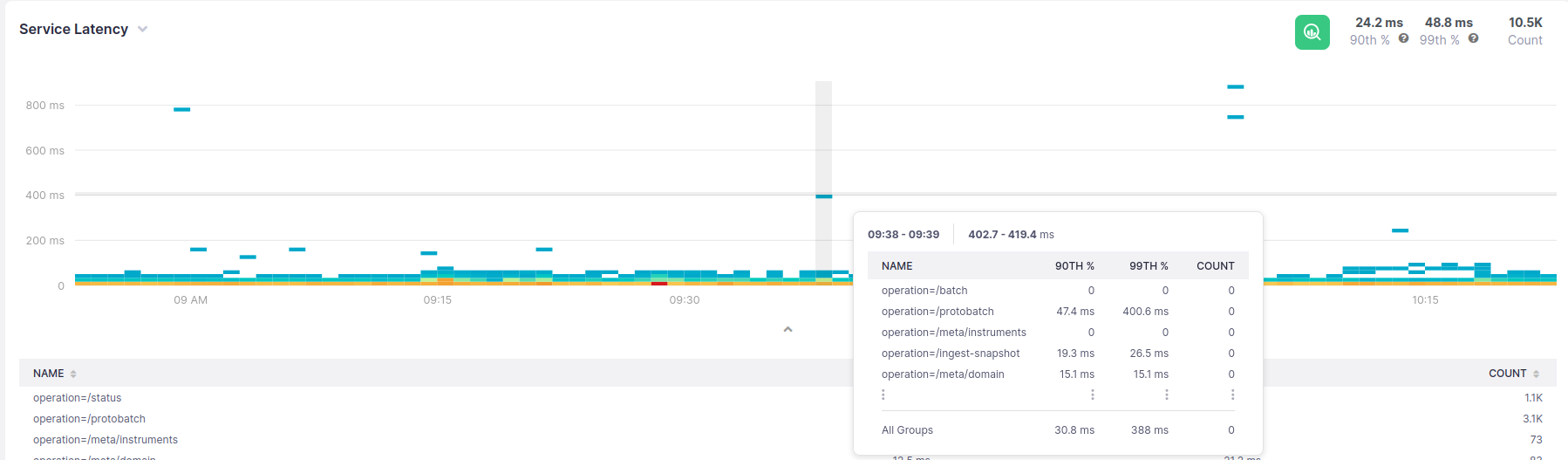
Any chart in the application can be hovered to show a tooltip. This tooltip contains details about values in the hovered area. For line or bar charts, the area in question is the time period on the x axis. For heatmaps, an intersection of the time on the x axis and value range on the y axis is shown. On percentile charts, information about the hovered percentile is shown - the percentile in question and the number of values above that percentile. Finally, for histograms, the number of entries in a range and the range itself are shown.
All of these show the same values as the legend, but specifically for the area shown. Additionally, on the heatmap, a count (per group) will be shown for that rectangular area.
The values will respect any grouping, if specified, but only up to 5 groups can be shown. These values will always include the group closest to the mouse cursor, which will furthermore be highlighted. Any additional groups above or below the hovered area will be indicated by ellipses. To see all the values, you will need to expand the legend.
In case of line or percentile charts, the values will be ordered by value in the bucket, in descending order. In case of histograms and bar charts, the order will match the order of stacking. Finally, for histograms, the values will be in descending order, by count inside of the particular bucket.
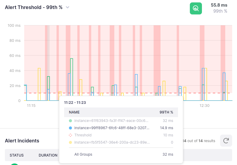
In the case of alerts, the threshold value will also be shown as a separate entry.
Hover, Selection and Zoom #
By default, legends and summaries will show values for the entire chart, rather than a section of it being hovered. The only component that will directly respond to hovering is the tooltip. However, summary and legend values can be constrained by making a selection on the chart. Selections along the x axis will also be synchronized between all charts that share a time axis (i.e., all but percentile and histogram charts). This means that making a selection on one chart on the time axis will highlight all charts on the page and update their legends and summaries.
With a few exceptions, which we will get into later, any chart with a time axis can also be zoomed into by clicking and dragging a desired time period. The selected area will be aligned to the nearest time period granularity, and will apply the change to other charts on the time axis. When a selection occurs, you can zoom into the selected time period, which will update the time picker. Doing this will transfer the application into fixed time mode, independently of the mode you are currently in. If you wish to return to live update mode, you will need to interact with the time picker.
The exceptions to this rule are as follows:
- Any chart without a time axis cannot be selected in this way (percentiles and histograms)
- Chart previews when creating alerts and dashboards cannot be selected
- The alert drawer preview chart cannot be zoomed into
- The analyze view has special behavior discussed in its own chapter
![]()
NOTE: Zooming in when not in analyze view or on the trace search page will only zoom into the time axis.
Additionally, when a selection is made, the analyze button will also appear. Clicking on this button will take you into the analyze mode with the selection already made. This will automatically apply to the trace list and suggested filters.
Chart Operations #
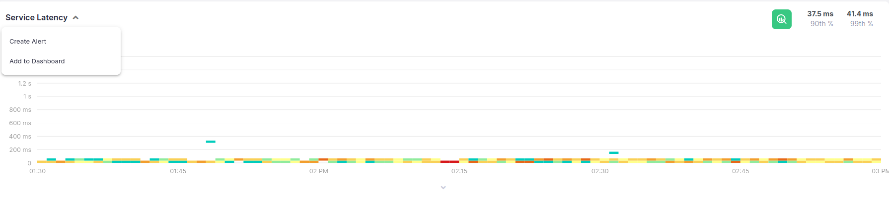
Every chart in Kamon APM has a set of operations that can be performed with it. They can be accessed by clicking the toggle on the chart name to reveal a dropdown menu. At the very least, you will be able to:
In certain contexts, such as dashboards, additional operations might be available, and will be outlined in their respective sections.
Additionally, upon hovering, each chart will show a green Analyze button. Upon clicking on this button, you will be taken to the analyze view, and will be able to drill down into the metric details and correlate traces.