-
Installation
-
With Kamon Telemetry
-
How To Guides
-
Migrations
-
-
Core Concepts
-
Foundations
-
Advanced
-
-
Instrumentation
-
Supported Frameworks
-
Akka
-
Akka HTTP
-
Cassandra Driver
-
Caffeine
-
Elasticsearch
-
Executors
-
Futures
-
JDBC
-
Kafka
-
Logback
-
Play Framework
-
Spring Framework
-
System Metrics
-
-
-
Reporters
-
Kamon APM
-
Using Kamon APM
-
Overview
-
Services
-
Traces
-
Dashboards
-
Alerts
-
Hosts
-
Investigating Issues
-
Settings and Administration
-
-
Adding Charts #
Dashboards are all about setting up custom charts to visualize the data you need to keep track of. This document will guide you through adding new charts to the dashboard. To learn more about arranging the layout of the dashboard, read about managing dashboards.
Adding a Chart from Scratch #
New charts can be added to a dashboard by clicking the Add Chart button on any dashboard. This will open a chart creation modal dialog where you can select your data source and visualization settings. Initially, there will be no preview, and nothing except the environment will be selected. By selecting an environment, you limit which data sources you can draw data from. You can select any of your environments, which will lock your chart to that environment. Alternatively, you can select Current as the environment, which will update the charts as you change the environment. When you use the Current environment, the list of Data Sources will be appropriate to whichever environment you are currently viewing. This means that the process of creating chart from the Current environment might be subtly different depending on which environment you are currently using when you start the creation process.
| Step | Required | Default Value | Explanation |
|---|---|---|---|
| Environment | ✔ | Current | Tied to specific environment or changes with environment |
| Data Source | ✔ | None | Service or usage statistic from which to track a metric |
| Metric | ✔ | None | Which metric to keep track of (e.g., jvm.gc or span.processing-time) |
| Filter By | ❌ | None | Only include records which have a metric tag matching all of the values |
| Group By | ❌ | Everything | Group by, and draw separately, according to value for selected metric tags |
| Chart Type | ✔ | Line | Which [chart type] to use to visualize the metric |
| Aggregation | Line/Bar only | p99 | For line or bar charts, how to aggregate the data |
| Percentile | Percentile only | 99 | For percentile aggregation, which percentile to plot |
| Unit | ✔ | Latency | Which unit to use to label the y axis |
Once you have selected the environment (or continue with the Current environment), you will need to select a Data Source. The Data Source can be one of three things:
- Any Service sending metrics to Kamon APM for this environment
- Host metrics being sent from your host machines
- Internal Kamon APM usage metrics (currently span ingestion statistics)
Upon selecting a data source, the first metrics in the list of available metrics will be pre-selected, showing a chart preview on the left.
![]()
When on the free Developer Plan, you will only be able to use the first 5 services added as the Data Source. You can read about service statuses and plans to learn more.
You will be able to select any of the metrics being sent by the service. These include span metrics, metrics provided by your active instrumentation modules, or any custom metric you are manually keeping track of inside of your application! Depending on the metric selected, you will be able to set up custom filtering (i.e., including only some data points) or grouping into separate values. The possible filters and grouping will correspond to the recorded metric tags.
After this point, the data is all set. What remains is to determine how we will visualize the data. In the second section, you can choose which type of chart you wish to use for the visualization. The options depending on your particular instrument type. For line or bar charts, you will additionally need to select which aggregation to show, as those charts can only display a single dimension across time. When showing a percentile aggregation, you will also need to enter the particular percentile you are interested in. You can view the possible aggregations, depending on the instrument type, in this table:
| Counter | Gauge | Range Sampler | Timer | Histogram | |
|---|---|---|---|---|---|
| Count | ✔ | ✔ | ✔ | ✔ | ✔ |
| Throughput | ✔ | ✔ | ✔ | ✔ | ✔ |
| Sum | ✔ | ✔ | ✔ | ✔ | ✔ |
| Min | ❌ | ✔ | ✔ | ✔ | ✔ |
| Max | ❌ | ✔ | ✔ | ✔ | ✔ |
| Meadian | ❌ | ✔ | ✔ | ✔ | ✔ |
| Mean | ❌ | ✔ | ✔ | ✔ | ✔ |
| Percentile | ❌ | ✔ | ✔ | ✔ | ✔ |
| Error % | ❌ | ❌ | ❌ | span.processing-time |
❌ |
A measure is a certain aspect, or aggregation, of a metric’s value. To configure alerts, we need data points through time. This is a simple matter with counters, but with other metric instruments Kamon APM allows you more flexibility. One special metric, span.processing-time, allows the error rate aggregation, which is the percentage of requests that are error, in overall requests. This aggregation will appear only if this metric is used, and will require you to always group values by the error tag, but never filter by its values.
Additionally, Kamon APM is not aware of the semantics of the data you are visualizing. You will need the select the correct unit to show, as one of Latency, Information, Count, or Percentage. The unit chosen will scale with the data, if applicable (e.g., B, kB, MB, or GB, depending on the scale of the data).
Finally, you may set a custom name for your chart. Otherwise, the name of the metric will be the default chart title.
When closing the chart creation dialog after having changed some of the data, you will be prompted to confirm your action, to prevent accidental loss of data.
Add Chart from Existing #
Not every occasion is one that requires creating charts from scratch. Instead, maybe you wish to reuse an existing chart from elsewhere in the application, possibly with some minimal changes. Kamon APM supports this by providing an Add to Dashboard action for every chart in the application, accessible from the context menu.
You can add a chart to either an existing dashboard, or to a new dashboard - in which case you will be required to name it, and it will be created in the background for you. The dashboard name will need to be at least three characters long, and unique amongst all dashboards in your organization.
When doing this, the dashboard creation dialog will be pre-filled with the values which the original chart uses, with the exception of the chart title. You can now save the chart, or use these values as a starting point, and tweak them until you get the chart you need.
Cloning Charts #
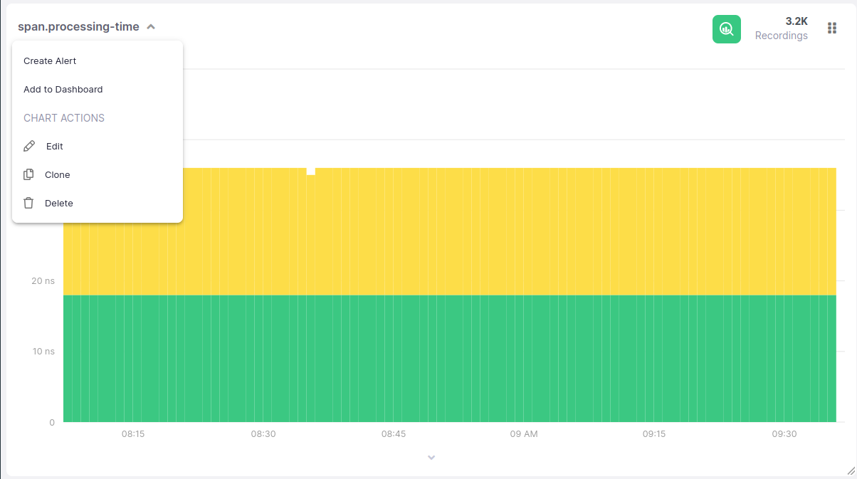
Similar to the previous action, you can also clone any chart that already resides in a dashboard. This action can be accessed from the dashboard chart context menu. Upon clicking on this action, the create dialog will be opened, pre-filled with the exact configuration of the original chart, but for the title, which will be same same title prefixed with “Clone of”. You can freely edit any value without affecting the original chart. A particular use case might be for when you wish to make two parallel visualizations of the exact same metric - a heatmap and a percentiles chart, for example.
![]()
A cloned dashboard chart will always be added to the same dashboard the original chart belongs to. If you need to add it to a different dashboard, use the create from existing chart flow.
Editing Charts #
Any dashboard can be edited to change its parameters (including invalid/placeholder charts). You can access this action from the dashboard chart context menu. This will open the edit dialog, which is the same as the create dialog, with pre-filled values. Upon saving, the chart will be updated in the dashboard and the changes persisted.