-
Installation
-
With Kamon Telemetry
-
How To Guides
-
Migrations
-
-
Core Concepts
-
Foundations
-
Advanced
-
-
Instrumentation
-
Supported Frameworks
-
Akka
-
Akka HTTP
-
Cassandra Driver
-
Caffeine
-
Elasticsearch
-
Executors
-
Futures
-
JDBC
-
Kafka
-
Logback
-
Play Framework
-
Spring Framework
-
System Metrics
-
-
-
Reporters
-
Kamon APM
-
Using Kamon APM
-
Overview
-
Services
-
Traces
-
Dashboards
-
Alerts
-
Hosts
-
Investigating Issues
-
Settings and Administration
-
-
Analyze Modal #
Once an issue has been detected, be it slow requests, long time spent in garbage collection, an alert incident, or anything else that might cause you concern, you can use the Analyze Modal to deep-dive into that issue, correlate metrics with traces, and get suggestions as to the root causes.

Almost any metric visualization in Kamon APM can be visualized. Any chart on pre-made or custom dashboards, aggregation summary chart, alert incident, and more, can be taken into analyze mode by hovering the chart or entry in question and clicking on the analyze button.
The Analyze Modal will open to overlay your current view, and will be frozen to the current time, even if you were viewing data in Live mode. The underlying assumption is that you wish to investigate anomalous data at a given time, and do not wish the data to change as you are viewing it. As with any time picker, you can switch it into live mode, and receive data as it comes in.
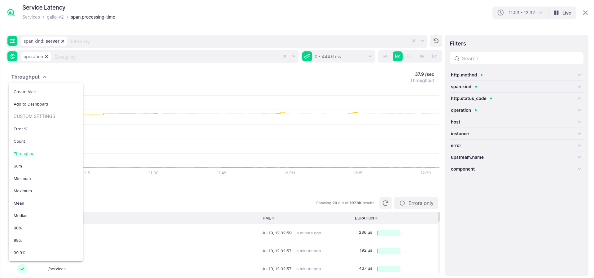
The modal will always show the same metric, and initially in the same mode of visualization (i.e., chart type, grouping, and more) as the original chart. From this starting point, you can do a lot more. Through the filter bar in the top of the analyze modal, you can filter by any available metric tag value, group by metric tag labels, or constrain the value range the metric takes (the y axis, for all charts but the histogram). Additionally, you can switch between any available chart type that is available for the metric you are analyzing. When picking a line chart or a bar chart, you can also pick between a variety of aggregations to use for visualization by toggling the chart title menu. The default operations will be count for the bar chart, and throughput for the line chart.
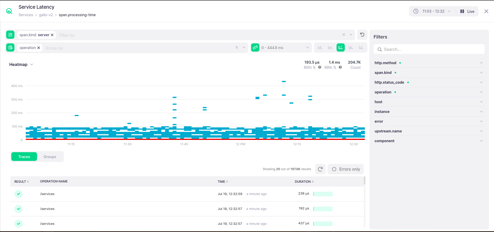
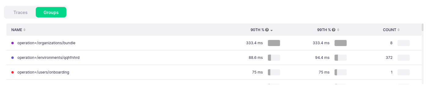
Trace List and Legend #
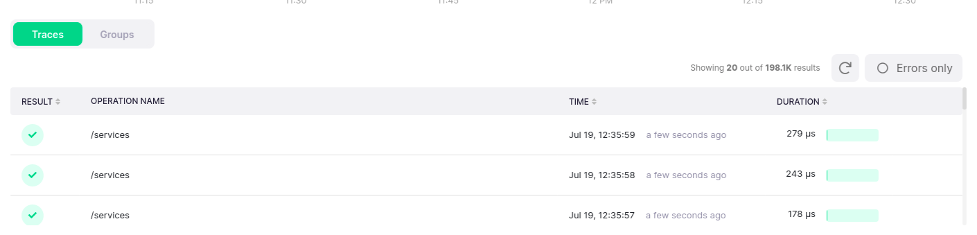
Below the chart, a trace list and a legend will be be present. The trace list will show all root spans that match the parameters. These parameters are:
- Time selected in the time picker
- Selection made on the chart
- Error toggle on the trace list
- Service for which the metric is being analyzed is service in the span
Time selection will always apply to the filtering of entries in the trace list. Selection on the value axis will only apply if the metric in question is
span.processing-time, which can directly be connected to the spans in the trace list. Note that the trace list will show any span that fits the criteria, even if it is not the root span of the trace (i.e., the span which starts the trace).
Using the trace list, you can identify which spans happened at the same time as the recorded deviations in metric values, and can investigate them further by sorting the list by duration or start time, or diving in by clicking on the entry and entering the trace details view.
![]()
If you are viewing the span.process-time metric, the error toggle will be applied both to the chart and the trace list. Otherwise, it will apply only to the trace list.
The analyze legend behaves much like the regular chart legend, with a slightly more detailed breakdown. It will show the groups in your chart, values aggregated for only those groups, and will allow you to click on any on the rows to toggle whether it is visualized on the chart. Unlike the regular legend, it is external to the chart iself, and can be found in a separate tab underneath the chart. The summary values will chnage if a selection is made on the chart, to reflect only the selected area.
Selection and Zooming #
Like most charts, the chart in the Analyze Modal can be selected by clicking and dragging over the chart. The selection is two-dimensional (both across time and values) for heatmaps, and one-dimensional otherwise (but for percentile charts, which do not allow for selection). This view has one key difference to the typical chart - when the selection completes, the chart will not be zoomed in automatically. Instead, you can click the zoom in button on the chart, or double-click on the suggestion, to zoom in.
Selection will affect the trace list, as well as the facets and suggestions, allowing you to more easily drill down into root causes and receive suggestions from the system as to the possible root cause.
![]()
If you are viewing the span.process-time metric, selection on the value axis will apply to the trace list, as well. Otherwise, only selection on the time axis will update the list.
Facets and Suggestions #
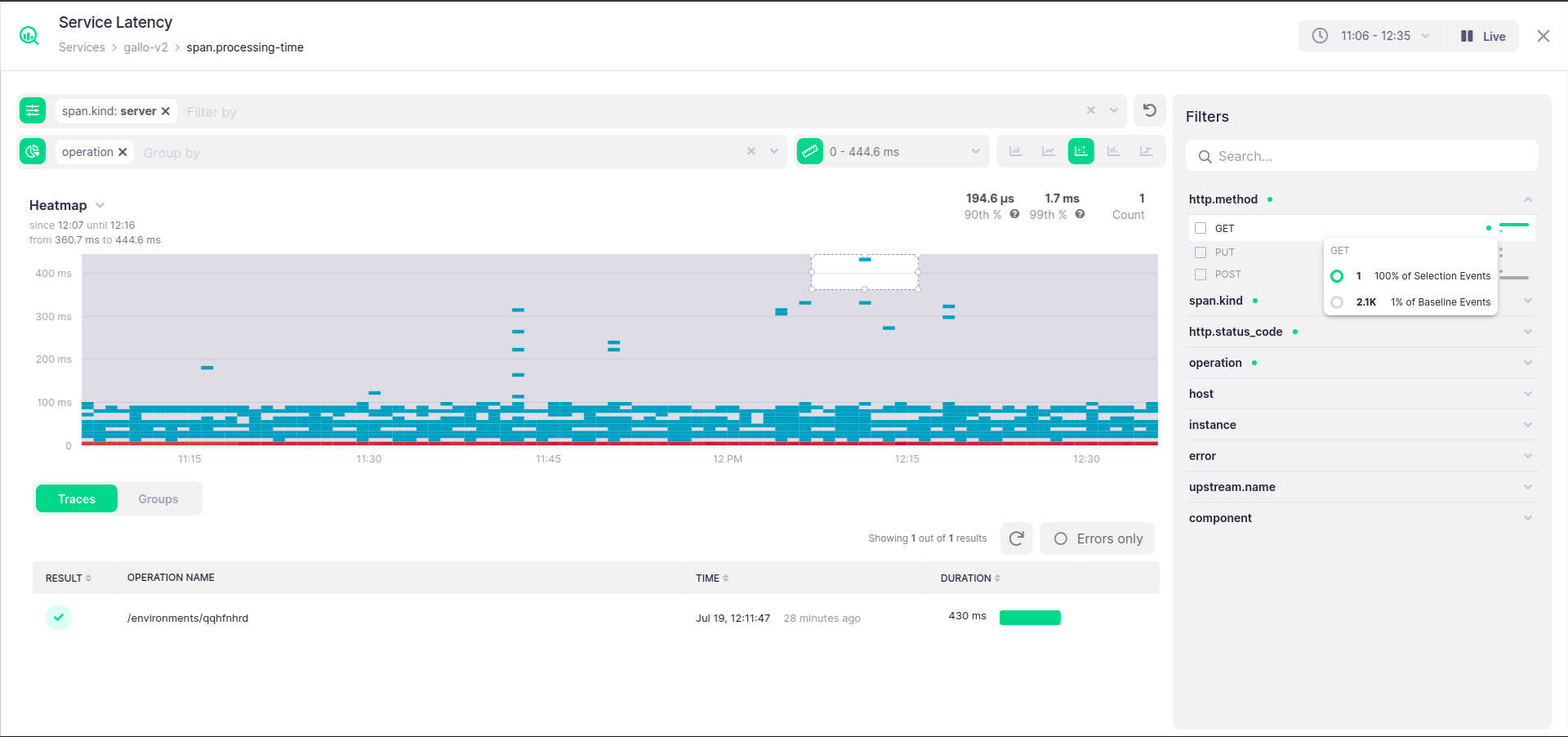
Together with the filter bar, the Analyze Modal provides another way to break down the chart by metrics - the Filters sidebar. Lying to the right of the chart, it contains the same groups and values as the filter bar, but with one important addition: it will include analysis of the breakdown of values by tags, and will suggest which filters might be applied to discover irregular values. Such a suggestion will be indicated by a green dot, which can be hovered for an explanation tooltip. Each value entry will feature a small blue indicator, which will show what percentage of recorded values have this tag attached to the time series. The indicator can be hovered for a more detailed breakdown.
These suggestions gain another dimension of usefulness when a selection is made on the chart. In this case, a second indicator will appear, this one green, to show what percentage of events in the selection have this tag, in addition to the percentage of such events in the entire chart. The detailed breakdown tooltip will expand with the same information, as well. This information can be very useful due to the fact that you can easily visually see that a particular selected area of the chart stands out in some way, be it a certain host, an operation, or maybe a particular database connection pool.