-
Installation
-
With Kamon Telemetry
-
How To Guides
-
Migrations
-
-
Core Concepts
-
Foundations
-
Advanced
-
-
Instrumentation
-
Supported Frameworks
-
Akka
-
Akka HTTP
-
Cassandra Driver
-
Caffeine
-
Elasticsearch
-
Executors
-
Futures
-
JDBC
-
Kafka
-
Logback
-
Play Framework
-
Spring Framework
-
System Metrics
-
-
-
Reporters
-
Kamon APM
-
Using Kamon APM
-
Overview
-
Services
-
Traces
-
Dashboards
-
Alerts
-
Hosts
-
Investigating Issues
-
Settings and Administration
-
-
The Alert Drawer #
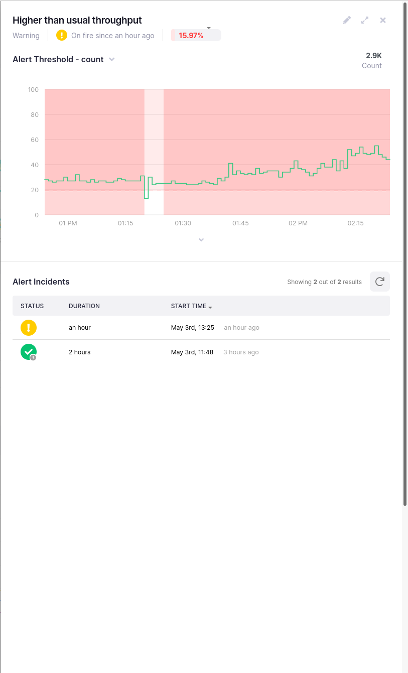
The Alert Drawer is your one stop shop for information about a particular alert. It gives you a quick overview of the alert status and parameters, lists recent incidents, shows the alert visualization, and allows you to go into edit mode. It can be accessed from many different points in the application, as detailed in the alerts lists chapter.
The alert heading lists a quick overview of the alert - its name, the severity of the alert, information and the comparison between the current status and the availability target. If the alert is active (on fire), it will state since when is the alert in this state. If there is no active incident, it will state the number of time passed since the service became healthy. The availability target status will be shown only if an availability target is specified. It will show three things: the configured target percentage as number and arrow indicator, the current status as fullness of the bar, and the color (green if met, red if not met).
![]()
The position of the availability target indicators are not linear. The precision increases with the closeness to 100%. This is to allow for precision for >p90 and >p99.
The right-hand-side of the header will always have three action: an edit toggle, to enter edit mode; an expand/collapse toggle, which allows you to expand the drawer to full screen width; the close toggle, to close the drawer. The drawer can also be closed using the browser back button, or by pressing the Esc key.
Below the header, a chart visualization of the alert will be present. It behaves as a line chart, but with several key differences:
- A threshold line will be shown, as well as a pale red threshold “danger area”
- Any incidents will be highlighted by painting the entire background of the area a semi-transparent red
- This chart cannot be zoomed into, but selection to update the summaries and legends can be made
Otherwise, it behaves like a regular line chart - you can expand the legend, analyze it, or create new alerts or dashboard charts from it.
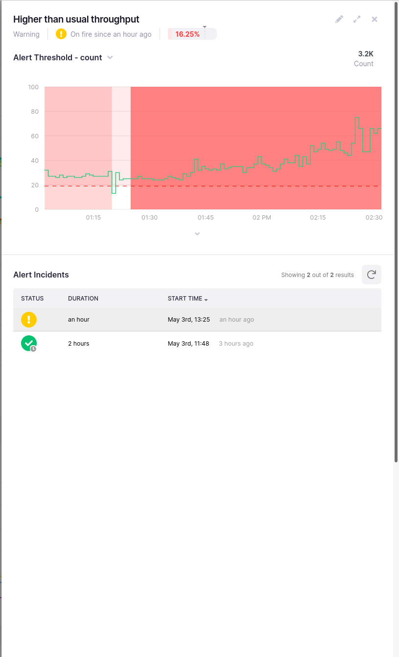
Underneath the chart visualization, you will see a list of recent incidents for the alert. Note that this alert will respond to the time picker. If you are in live mode, all alerts in that time period will be shown. Otherwise, alerts will be shown for the frozen time period.
Each incident will display its status (and a small clock marker on it if it has completed), the duration of the incident, and the start time, both as a date and time, and as the amount of time that has passed since its beginning. Note that for ongoing incidents, the duration and the time since it started will always be the same, since the duration is in fact the duration thus far.
The alert incident list will refresh automatically every minute, but can be forced to refresh manually by clicking on the refresh button in the top right corner of the list.