In this article we discuss the origin story of Kamon’s Range Samplers: what they are, how they work, and how we use them to monitor queues, connection pools and more.
The Origins
It all started with us wanting to monitor an Akka Actor’s Mailbox. It was a wild ride, and in the process we discovered that the same techniques we applied to mailboxes can be used to monitor other resources. We will stick to the idea of monitoring queues for now, and visit some of those other use cases later in this post.
Let’s start with an imaginary queue with the following behavior over time:
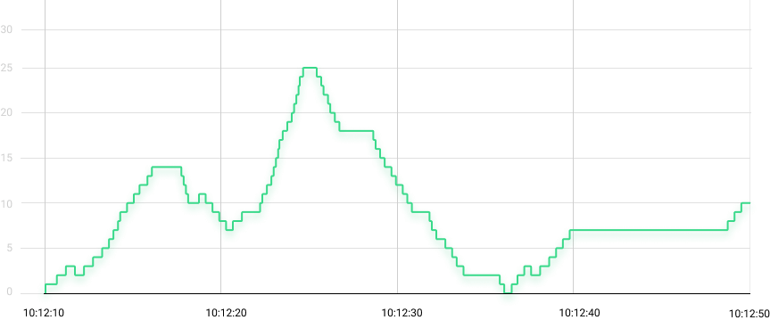
The queue size goes up and down as elements flow through it, and every now and then there are periods of inactivity signaled by flat lines.
So, how do we monitor this thing?
The basic monitoring instinct says: create a gauge for the queue size and update it every time an element is added or removed from the queue.
Implementing the initial idea and exporting the gauge’s value every 10 seconds yields recordings represented by the black line on the chart below:
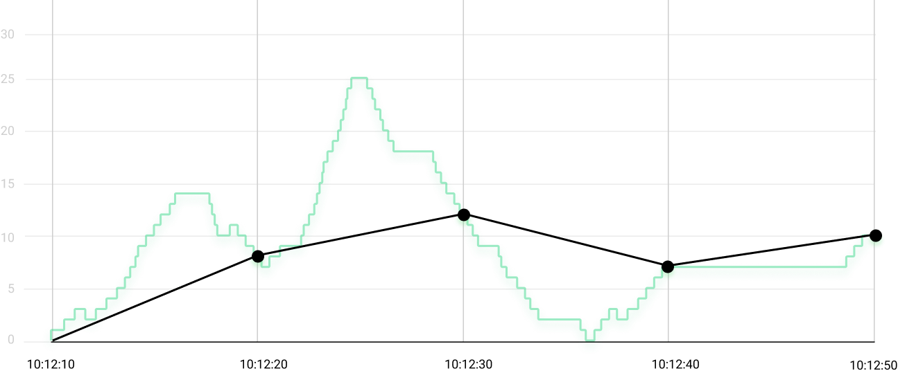
All the activity in those 40 seconds got reduced to four numbers: 8, 12, 7 and 10. That’s some data, but far from enough to describe what really happened in those 40 seconds.
We are missing out on two important aspects of the queue’s behavior:
- There was a spike of more than twice the highest value we got from the gauge (notice that 25 during the second period).
- There was a brief moment when the queue was able to catch up with all the work (notice that 0 during the third period).
This queue might have grown to hundreds of elements for a small period of time and we wouldn’t have noticed. Let’s try to fix that.
Challenge #1: Monitoring Peaks and Lows
If we are interested in peaks and lows, we could create two more gauges tracking the lowest and the highest queue size values seen during the last reporting period.
These two new gauges must be updated every time the queue size changes. Also, these two gauges must be reset to the latest queue size value at the beginning of every reporting period, so that they “forget” behavior from previous periods, and only track the newly set highs and lows on the current period.
Drawing those two extra gauges give us to the red and green lines below:
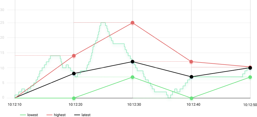
The highs and lows can tell us a little bit more about the queue’s behavior:
- We can see that the queue had a spike of up to 25 elements during the second period.
- We can also see that the queue was able to catch up with all the work when the lowest went down to zero during the third period.
These two extra gauges give us a better idea of what range the queue operates on. That’s much better than the initial example, but we can do better than that.
Challenge #2: Improving Granularity
The solution we created so far can tell us about the peak queue size of 25 during the second time period, but a few questions remain open: for how long was the queue size at 25 elements? Was it most of the time? Was it a quick blip? There is no way to know.
Here is what we tried:
What if we use a histogram instead?
Instead of three separate gauges, we could store the queue size in a histogram. That means recording the queue size in a histogram after elements are added or removed from the queue. This would bring a few benefits:
- We would never miss any peak or low, since every update to the queue size would be stored in the histogram.
- We would be using a single instrument instead of three, that makes it easier to visualize and reason about the data.
- We would get a clear indication of when the queue is more or less active, based on the number of recordings in the histogram.
This seemed like the perfect solution, but we couldn’t go forward with it. It is sad that we didn’t keep the data from years ago, so you will have to trust us on this: using histograms to store the queue size was awesome, but the performance impact in high throughput scenarios with hundreds of queues (in this case, Actor mailboxes) on the same JVM was higher than what we could afford.
Quick note about histograms: when we talk about histograms, we are always referring to HDR Histograms. That’s what Kamon uses under the hood. HDR Histograms let us track values with 99% accuracy, and they are crazy fast, but that’s something we will discuss in a separate post.
What if we report data every second instead?
We could get a better idea of what is going on with the queue if we record and visualize the three gauges (lowest, highest, and latest queue size) in 1-second periods. It is less likely to miss a spike or a low when recording data more often.
We didn’t have that possibility back in the day. We were tied to a monitoring tool limited to 60-second intervals, and migrating to other tools was not on the table.
The scene has changed a lot over the years, and nowadays many tools allow for 1-second periods, including Prometheus, Graphite, InfluxDB, and several more. That doesn’t mean that you should do it, though.
Reporting and visualizing data in 1-second periods comes with with a burden: a lot more data needs to be transferred to, and stored by, your monitoring solution. Your mileage may vary, but in many cases it is not practical to go for 1-second periods because of the additional overhead on the network and storage. It is possible, but not practical.
What if we mix all these ideas together?
We knew it was important to track highs and lows.
We knew that histograms were a very good fit for storing and exporting the queue size recordings.
So, what if we keep the lowest, the highest and the latest queue size values in three separate variables, and record those three values in a histogram once per second? We would never miss a high or low, and we could get an idea of how much time was at each level based on the number of recordings, all without the performance impact of recording every single observed value.
And that’s how Range Samplers were born. In the early days we called them “Min-Max Counter”. Terribly name, we know. They were later renamed to Range Sampler, and we use them all over the place in Kamon’s automatic instrumentation.
Welcome the Range Sampler
With all the story behind it, now we can say a Range Sampler is a Kamon metric instrument that has three special characteristics:
- It keeps track of three variables internally: the lowest, the highest, and the current queue size values. Nobody gets to see these variables from the outside world.
- It records the lowest, the highest, and the current queue size values into a histogram every 200ms.
- It produces a histogram with a bunch of samples of the queue size at the end of every time period.
For example, the histogram produced by a Range Sampler in a 10-second period has 150 samples of the queue size, and it is guaranteed to contain the lowest and highest values seen during that time interval. We managed to keep track of every high and low without compromising performance, and to record enough samples to overcome the granularity issues.
It might not make sense at first glance, but wait until you get to the visualization section below.
Similar Use Cases
With time we learned that any variable that moves up and down, and usually returns to a baseline value (zero most of the time) can be monitored with a Range Sampler. For example:
- A database connection pool borrows and gets back connections all the time. You can monitor the number of borrowed connections with a Range Sampler, and see how the pool behaves between zero (no connections being used) and the max number of connections available (all connections being used). Kamon’s HikariCP automatic instrumentation does exactly that.
- You can count the number of requests a HTTP Server is currently handling with a Range Sampler, and get an idea of how concurrency can affect the server’s performance. Kamon does this automatically for Play, Akka HTTP, and other supported HTTP frameworks.
Now that you understand how Range Samplers work, matching these principles with other use cases should be piece of cake. Let’s leave the theory behind and get practical.
Visualizing and Interpreting the Data
Here is where most people get lost. Reasoning about why a queue size metric is producing a histogram distribution instead of a single value does not come easy at first. In fact, it sounds crazy! But once you understand the challenges mentioned above and how data gets collected, then you can start to see how to get interesting insights out of the data.
Understanding Operating Range
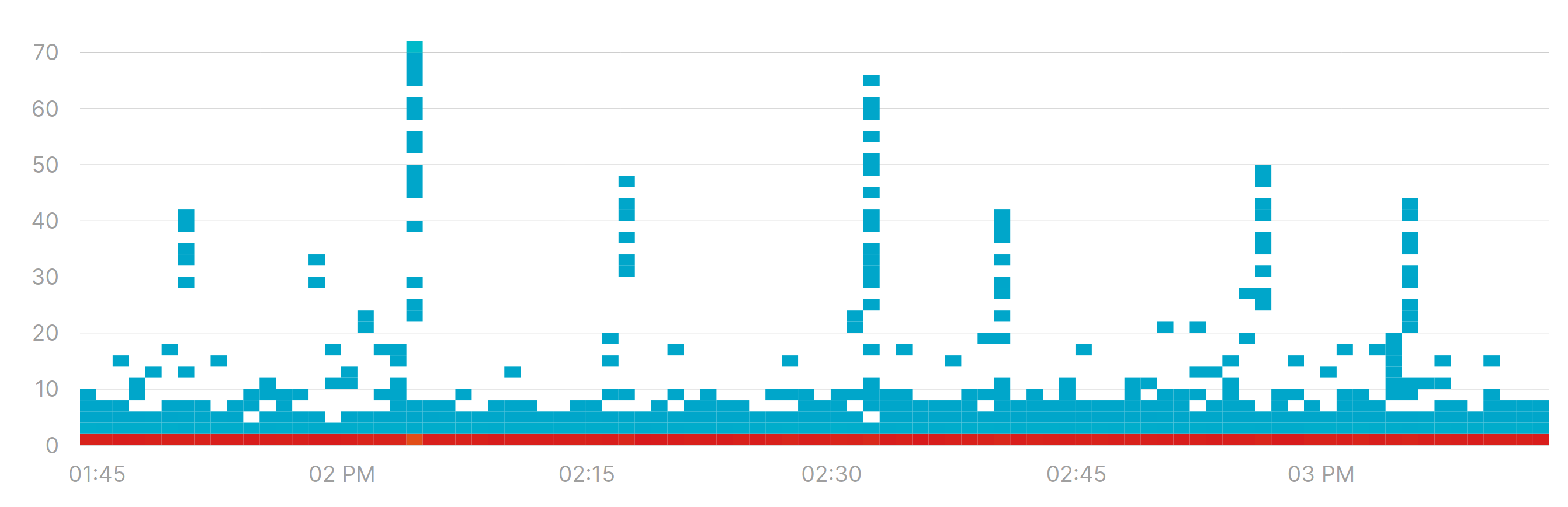
Instead of focusing on absolute figures like “the queue size is 50”, what you really want understand is the range and the most common area in which a queue operates, if any. Heatmaps are excellent tools for visualizing exactly that:
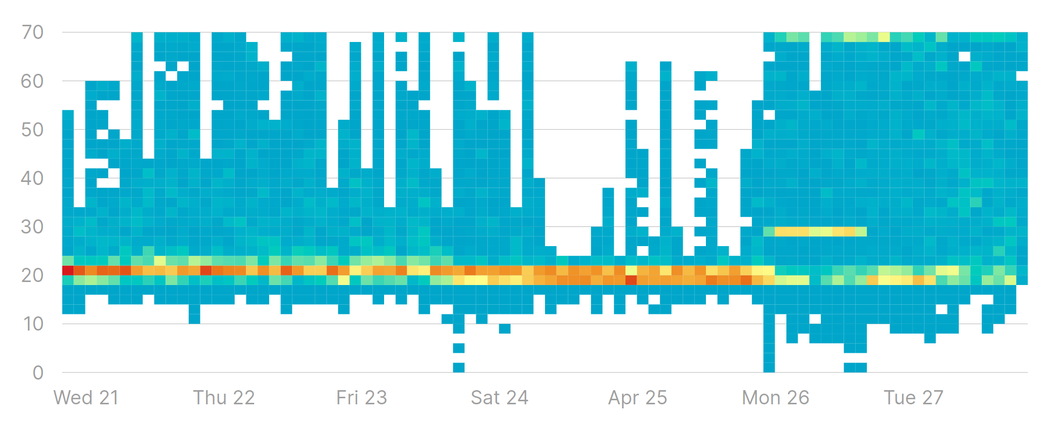
There are several insights on the behavior of a queue from looking at this heatmap:
- It rarely goes below 10 elements. This means that there is almost always some work waiting to be done in the queue.
- It never goes above 70. Signaling that even though there are spikes in the amount of work to be done, it is never getting out of hand.
- Most of the time the queue size stays around 20 elements. That’s where the “heat” is concentrated.
If you ask me, the queue above is a well behaved one. It has spikes from time to time, but its size is always within a consistent range from 10 to 70 elements. Nothing to worry about there.
Let’s look at a very different example:
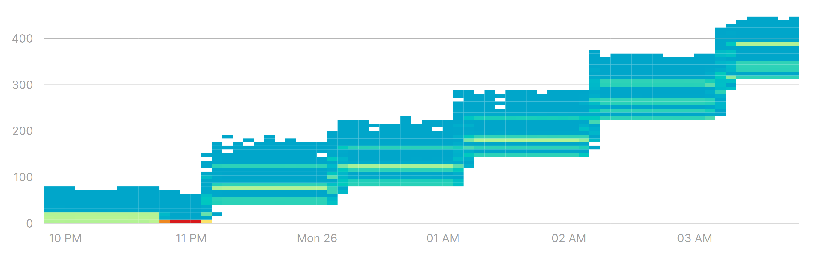
That’s not the kind of heatmap you want to see for a queue. After 11:00 PM the queue size started growing and the lowest value never made it back to zero. Spikes are not necessarily a bad thing, but when a queue size doesn’t make it back to a baseline value it signals two important facts:
- There is more work than what the queue can handle. You probably should add more processing resources or improve processing performance.
- The queue is on its way to an overflow. It might take a few minutes or hours, but work is piling up in that queue and it will eventually lead to out of memory and/or garbage collection issues.
The important part is that the lowest, highest and most common values are the only signals that can really tell you something about a queue’s behavior, and help you draw conclusions on whether you should act or not.
Understanding Resource Utilization
Let’s say we are using a Range Sampler to monitor borrowed connections in a connection pool, and we get a heatmap like this:
Those spikes might require some attention. Are they something we should worry about?
We can take advantage of Range Samplers having a fixed number of recordings for each time interval, and use percentiles as a measure of how much time a queue was at certain size or bigger. For example, we can draw the p99 over time instead of a heatmap:
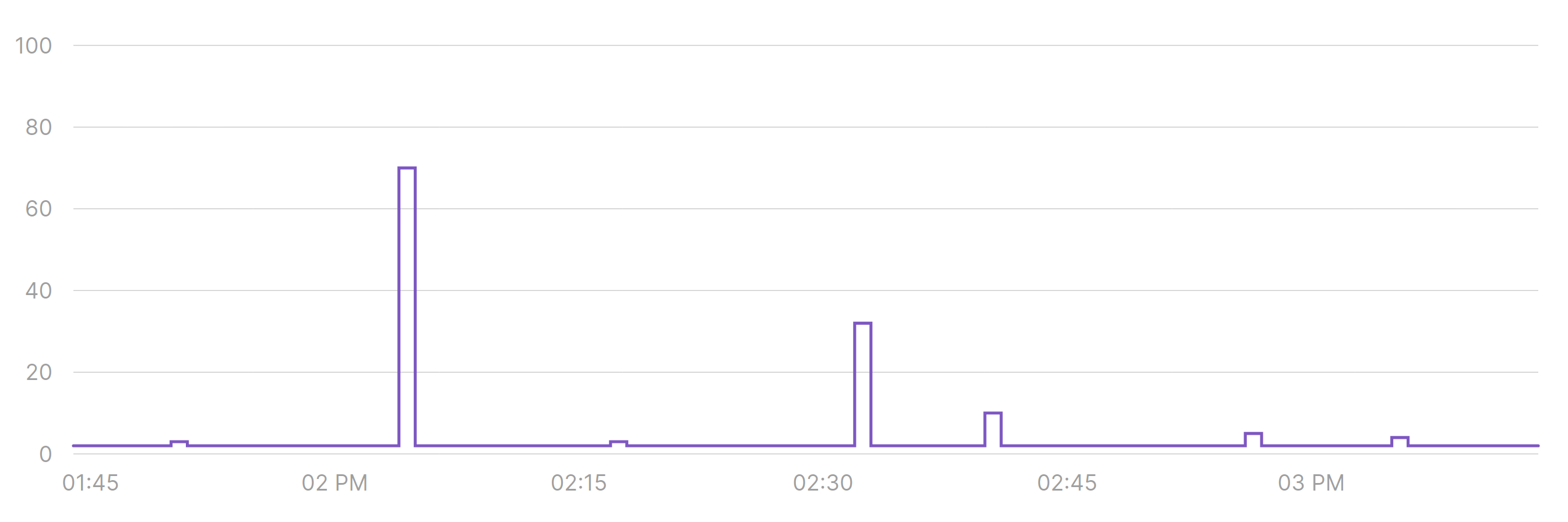
In most time periods, 99% of the time there is no more than one borrowed connection. This also means that most of the noise we see on the heatmap must have happened in the remaining 1% of the time, so probably nothing to worry about.
We can go further and analyze all percentiles across the entire time period, getting a better idea of the overall behavior for this connection pool (notice that the horizontal axis represents percentiles, not time):
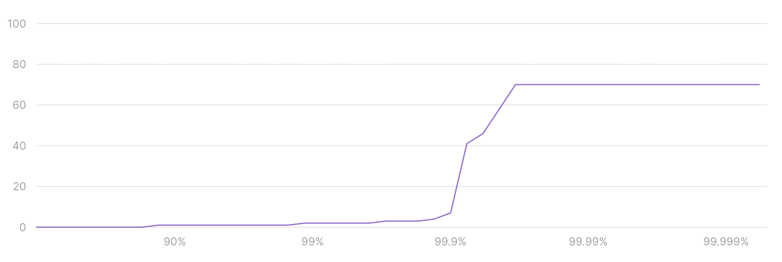
Now we know that:
- 70% of the time there are 0 connections being used. That’s a lot of downtime.
- 99.6% of the time we use up to 3 connections.
- All spikes we see must have happened on the remaining 0.4% of the time.
Depending on your use case it might be fine to have these very brief spikes in activity. Maybe it is not fine, and you need to spread the load across time to avoid spikes from happening. That’s up to you, though. What matters is that Range Samplers get you the data you need to decide whether to do something or not.
Overcoming Monitoring Tool Limitations
Not everybody has access to pretty heatmaps and percentile charts. So what then?
If your monitoring tool can’t produce the same visualizations we showed in this post, you can always stick to the basics: plot the lowest, the highest and maybe the average of all data points.
There are many reasons to stay away from averages, but given the way Range Samplers work it might be better than no data at all.
The Big Takeaways:
Here are the three things you should remember from this post:
- Range Samplers help you understand the range in which a variable operates, and they are typically used for monitoring queues, connection pools, and concurrent requests. And anything that looks like them.
- Heatmaps are the most useful way to visualize a Range Sampler’s data.
- You can supplement heatmaps with percentile charts to get deeper insights into the Range Sampler’s behavior.
Feel free to reach out on Twitter via @kamonteam with comments and questions, we will be glad to hear from you!
Ready to Monitor with Range Samplers?
Range Samplers are a part of Kamon Telemetry, and you can use them regardless of where you send data to. The heatmaps and percentile charts in this post were taken from Kamon APM.
If you want to use the same tools to monitor your queues, actor mailboxes, and a lot more, Give a Try to Kamon APM